
Case Study 2
Bringing up to scratch

The goal of this commission was to get the very best out of a property in preparation for sale.
The house was a well built brick veneer. Generally it was in sound condition, but had not been updated for very many years. The vendors who had bought the property as an investment, were in the process of putting the property to market, but needed it be brought up to the highest standard to achieve maximum yield.
After assessing the property we concluded that apart from a handful of big ticket items, a lot could be achieved with creative thinking and tasteful modernisation.
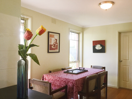
The walls were all white, which helped to lighten a small house, but we felt it a little stark and lacking any 'personality'. We settled on a light corn colour. Still light enough to open up the rooms, but with enough subtle colour to soften the overall feel.
We replaced all the plain box doors with panel doors, painted in the same colour as the walls and fitted brushed steel door furniture. We dressed the bedrooms to reflect the colours we had chosen for the decor, using strong, earthy colours and textures.
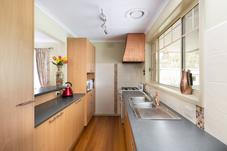
The Kitchen
 |
 |
The kitchen was a galley style layout with a dining area at one end. Quite compact, the cabinets were in good condition and worth keeping, but there was little storage space.
At the end of the galley kitchen was an opening into the lounge area. There was also a servery which looked into the lounge. The decor was tired and tiles were cracked and discoloured. We needed to come up with ideas that spruced up the appearance and also to try to get more cupboard space as there were no overheads due to the breakfast bar and servery.
After plotting out the spaces and functionality, we concluded that the walk-through at the end of the galley was superfluous. By walling up the opening, we had the opportunity to use the space created to install more storage space. Our cabinet maker was able to match the existing wooden cabinets and worktop perfectly and we included large drawers for pots and pans. We also designed worktop for the microwave, which had previously sat on the servery counter.
After scouring tile suppliers, we finally came up with a tile design that was a little more contemporary, without being too out there. We were aware that we needed to keep the property within the tastes of the majority in order to attain the maximum interest for purchasers.
We replaced the tapware and light fittings to more contemporary designs.
The Utility Room

The existing laundry was cramped and difficult to work in. Whilst the utility room is not a room people often give much thought to, we believe it must be as easy to work in as possible. The existing room was very basic. It had a free standing washing machine and a sink. That was about it.
In addition, there was another door which led to the toilet. This gave residents two access ddors to the toilet - one from the utility room and one from the bathroom. That was one too many! We had our contractors remove the door and plaster it up to allow space for hangers to accommodate mops and brushes etc.
After sketching out a few ideas and analysing the space usage, we went about improving the room.
We designed and installed fitted cabinetry, with updated tapware and sink and a space suitable for a front loader to maximise the space. The layout incorpoated the washing machine and two good sized cupboards to store cleaning materials.
We continued similar modern tile designs from the kitchen as splash backs in the Utility room and had custom-made overhead cabinets installed for extra storage. Other items such as contemporary light fittings and fold-away towel rail were added to optimise the space. Although the house was fifty years old, it now had a completely contempory feel.
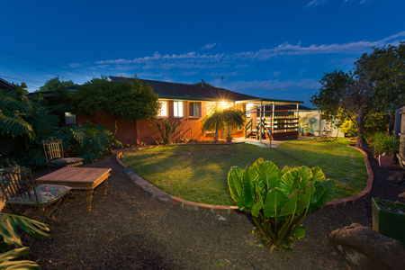
Outdoors
 |
 |
The back garden was fairly ordinary, to be truthful. The house had a small covered verandah, which overlooked parkland. Our design needed to make the most of this as it's location near to parkland and relative seclusion and turn it into a pleasant place to spend time outdoors.
Our first task was to replace the aged fencing, and at the same time, include a gate to enable the homeowners to access the park easily. We designed a new lighting plan and refurbished the deck and verandah area. Our gardeners planted hardy perennials and we designed an organic shaped lawned space that was curved to give a relaxed air as well as the practicality of a hard edge to maintain the lawn.
There were areas of the lawn that had been identified as problem areas to mow and maintain. We took this into account and replaced the grass with scoria beds and potted plants. The result was a calming, but practical garden area that was easy to maintain.